Building better user interfaces for text entry
This article is over 12 months old, and may be out of date or no longer relevant.
But you're here anyway, so give it a read see if it still applies to you.
This article was written for and originally appeared on Blueprint by Tiny.
Collecting data from your users is more than just putting some fields on a page and hoping for the best. The layout of your data entry forms can provide so many cues to your users, including highlighting required fields, grouping similar topics, and providing real-time validation alerts to help improve the quality of your data.
The types of fields you choose can also benefit your users – an input field can visually signify a short entry, whereas a textarea can allow longer text and preserve line breaks. This can be taken one step further by adjusting the visual appearance of your fields to match the expected length – a short response of up to 20 characters may have a smaller width than a field that expects up to 200 characters, or a short textarea may have a few rows, whereas a long textarea may be double or triple that size. Using TinyMCE, you can also make it easy for your users to style their content and generate HTML markup seamlessly.
As you build your forms, consider the data entry needs of your users, and what would work best for them. Let’s take a look at the common options for you to pick from.
input
The basic input field. It is probably the very first field you include on your form for a “name” or “label” type field.
Input fields are great for collecting simple strings of data, and can have a maximum length, provided that is enforced by the user’s browser – really useful for only allowing users to enter a string up to the size that matches your database, and even marking fields as “required” (just remember to perform all validations on the server-side too).
When you are happy that an input field is the best choice, the next step is choosing the right type to use. By default, an input field’s type is just “text” – and that’s pretty self-explanatory.
If your field is for an email address, change the type to “email”. Not only can the user’s browser take care of some validation, but on mobile devices, keyboards are optimized for email address entry, including priority placement of symbols like “@” and “.”. Similarly, “tel” can provide a telephone-number-friendly keyboard on mobile devices – and these little tweaks, while not ground-breaking, can improve the user’s experience with your form.
You could also use “date” to use the browser’s date/time picker – but browser support is a little inconsistent – or “password” if you want the user’s entry to be masked from view. There are so many different field types available – including switching to non-text input like “checkbox”, “radio” and “range” – so an input is a field that can be used in so many ways.
Input fields are designed for short, small entries, and are not suited to data that requires multiple lines or expands greatly beyond the visual appearance of the field on the screen. If you need more space, you may want to consider a textarea.
textarea
When your data entry grows beyond a short, single-lined string, a textarea is your next best choice.
A textarea, by default, can be resized by the user – allowing them to grow the visual appearance of the field – and can also take advantage of attributes like “maxlength” too, just like an input.
The biggest difference though is that a textarea is designed to allow for multiple lines to be entered – unlike an input, when the line reaches the far edge of the textarea, it will start to wrap to the next line, allowing longer pieces of data to be seen at once, in a field that is taller than a single line.
While new line characters are accepted in the textarea, you can choose what you want to do with them when processing and saving your user’s information – you could preserve them (and convert the line breaks to <br> at display), or you could trim them out and just allow the user to enter larger wrapable single-line strings.
If you are just collecting a short string, like a name or email address, a textarea is overkill – both visually for the user, and missing some of the additional user experience features that an input can provide.
If multiple lines and longer entries are good – but you still want to give your users more – then you may want to consider using TinyMCE on top of a textarea too.
TinyMCE (on top of a textarea)
TinyMCE offers users a best-in-class rich text editing experience – yep, that mouthful-of-an-acronym – What You See Is What You Get (WYSIWYG).
The most common way to get started is to configure TinyMCE to create an editor on specific textarea elements on your form, either by an ID or class. If your text area has a “tinymce” class:
1<textarea class="tinymce"></textarea>You can then target this textarea (and any textarea with the “tinymce” class) by starting your TinyMCE config with:
1tinymce.init({2 selector: "textarea.tinymce"3});TinyMCE will give your users the ability to create rich content – including a familiar word processor-like interface to help style and adjust their content, while TinyMCE generates clean and quality HTML markup under the hood.
If you are new to TinyMCE, you can get started in less than 5 minutes.
The best thing you can do to give your users the best authoring experience is to configure TinyMCE to give your users exactly what they need for that specific field. You have full control over the appearance and contents of the TinyMCE editor toolbars, menus, plugins, and options. You can tailor these to meet your user’s needs. Take some time to work through the TinyMCE configuration options documentation, as well as checking out different demos to see different configurations in action.
If you have a smaller textarea, perhaps for a bio or description, that still needs some basic formatting like bold, links, and lists, you can configure TinyMCE to target those fields with one configuration, including simpler toolbars.
Then, when you have a larger textarea, perhaps for article content for a web page, you can provide a different set of TinyMCE configuration to target those fields, with more advanced toolbars including styles and formats, image uploads and source code view.
This flexibility allows you to take advantage of TinyMCE’s features, but not necessarily overwhelm the user with editing options that may not be needed for the content in the field they are completing.
Simple
Think about a form for creating an article for your website. Let’s assume you have a short introduction field, and also need the full article content.
Let’s start with the introduction field, and configure a simple TinyMCE editor. We want to allow our users to add some basic styling (Bold, Italic, and Underline), or create a list – but we don’t want them uploading images, adding links, or changing styles.
We can achieve this by targeting any textarea with a “simple” class using this TinyMCE configuration:
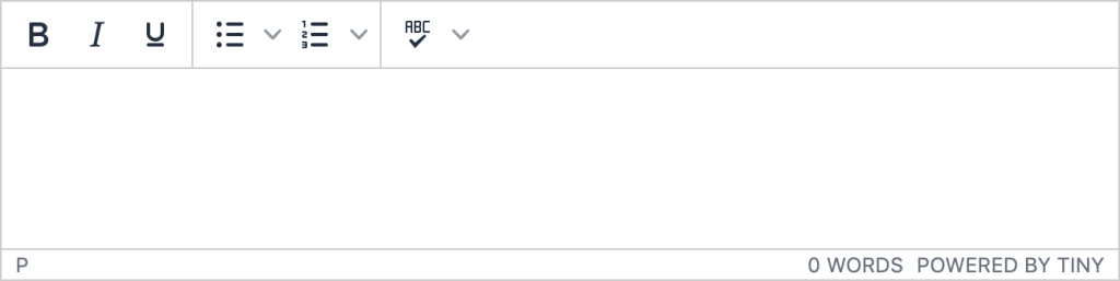
1tinymce.init({2 selector: "textarea.simple",3 plugins: "advlist lists spellchecker autoresize wordcount",4 min_height: 120,5 menubar: false,6 toolbar: ["bold italic underline | bullist numlist | spellchecker"]7});This simple configuration is applied only to textareas with the “simple” class, includes a small number of plugins and a very simple toolbar, and also sets a small minimum height, showing visually that it is a smaller field.
Advanced
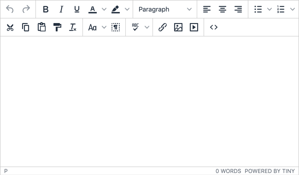
For our page content, we want to give our users more advanced controls – and the ability to do more like add links, insert images, and adjust styles.
Because we have done this with a new init call, we can have both of these configurations running on the one page – and you could even create other configurations for different use cases. For each new configuration, all you need to do is add a new tinymce.init call to your script, and suddenly you are providing the power of TinyMCE but optimized for different scenarios to keep them focused on their authoring.
Here’s a CodePen with these simple and advanced configurations of TinyMCE on the same page:
contentEditable
contentEditable is an attribute that you can attach to any element in your HTML markup that can make it editable. For example, you could make a div editable by:
1<div contenteditable="true">...</div>But the big question here is: why would you do this?
Certain HTML elements provide semantics – and this information is valuably used by assistive devices such as screen readers to announce differences in structure. For example, when a screen reader reaches the start of a form and starts working through the fields, these are announced as form fields.
A div element does not have that same level of semantic purpose – the HTML spec already has form elements that are user-editable, so why try to reinvent the wheel with a non-standard approach? Use the expected elements for their expected and semantic purpose – not only for the best browser compatibility, but also for the best user experience for users who rely on assistive devices.
Conclusion
As a developer, when you design your data entry forms, ask yourself what the purpose of the field is, and you can help pick the best field for each scenario:
I need the user to enter something simple, like a “name” or “email address” for an entry: input.
I need the user to have multiple lines of plain text: textarea.
I need the user to have WYSIWYG editing: TinyMCE.
And don’t forget, when using TinyMCE for your forms, take some time to tweak the editor interface options to configure the TinyMCE toolbar and menu items to match what your users will need.
TinyMCE configured with custom skin and icons, and toolbar options grouped on the bottom.